
An experiment in audience based categorization
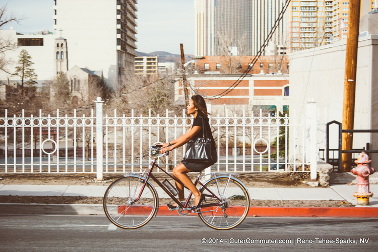
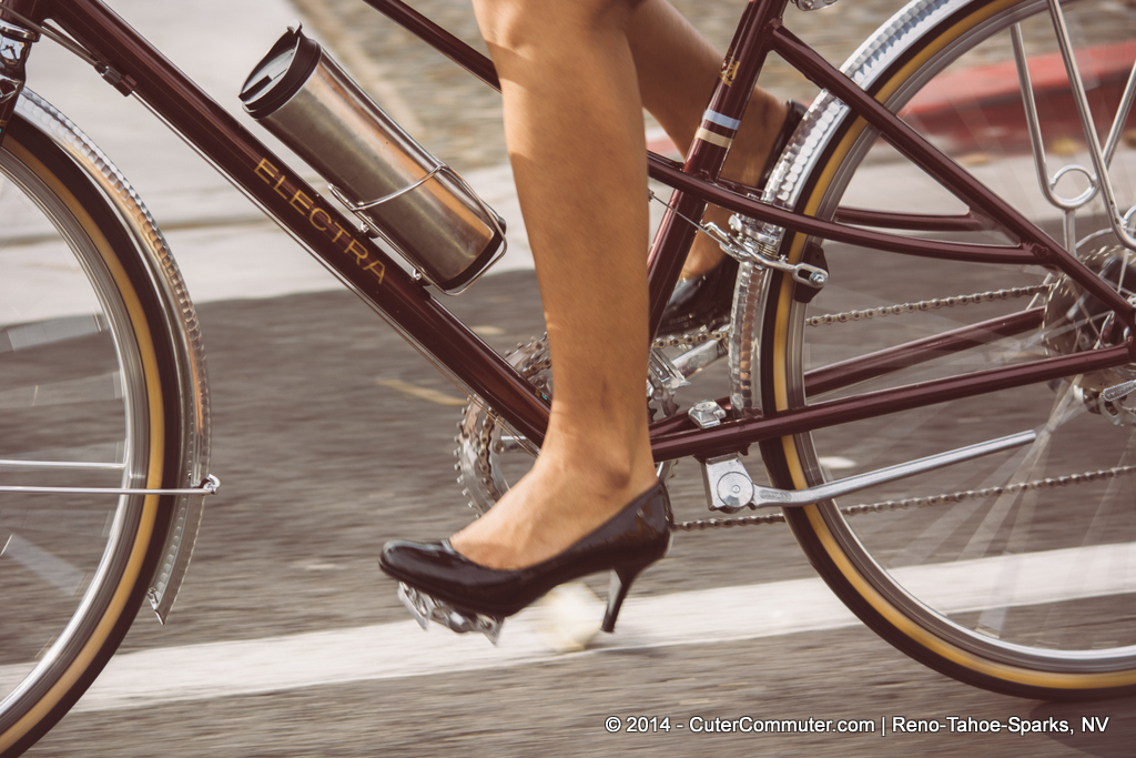
Urbanbiker.com offers highly curated gear for the stylish urban bike commuter


Challenge: I don’t like how bike gear is sold online: huge lists, unreliable reviews, no context. It’s difficult to figure out if the hardware will work on my bike.
My Goal: To improve ways to present and categorize products. Could we use personas and highly curated content as a way to successfully present and sell gear?
Advisor: Larry Sisson, Principle, Eight Arms (IxD); Max Eichbaum, Amazon, (Prototyping, Usability Testing)
Solo project:
Concept, Research, IA, (3 weeks)
Wireframe, Prototyping, Usability Testing (2 weeks)
Outcome: Failed concept, learned about usability testing, mental models, the drawback of audience based categorization, and predefined modules.
The Concept
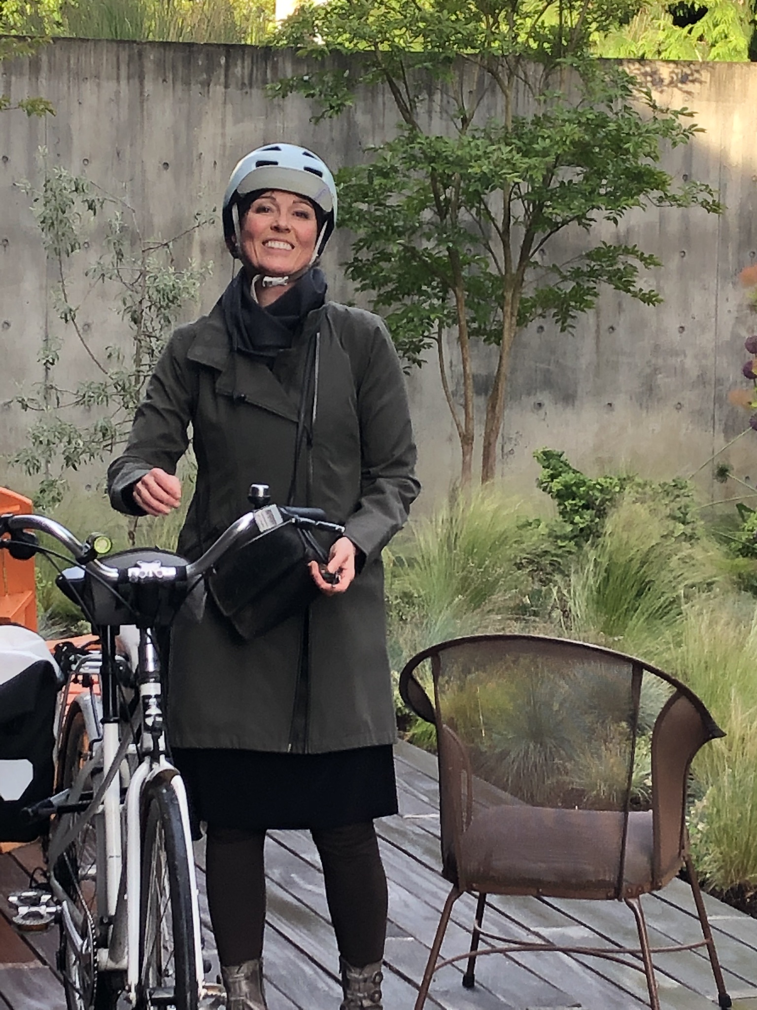
Introducing gear by showcasing a commuter (persona), their story, and what kind of gear they use on their bikes.


Generative Research
Comparative Study: REI, Cascade Bicycle Club
METHODOLOGY: Individual, observational Interviews:
KEY FINDINGS:
Most participants used search function to find what they were looking for.
Browsing and selection were mostly based on photos.
Price and brand matter, return policy is important.
Testers did minimal research and no tech comparisons between products.
Conclusion: Too many choices not a good thing.
Users didn’t really drill down on a list of products. All 4 participants were looking for images or videos of the act of commuting or wanted to see the gear in action.
“I don’t see what I want, (on the first page), now I’m getting bored, I will look at something else”

Is there research that shows that offering up limited but highly curated gear could decrease cognitive load and ultimately increase sales?
“In certain situations, we benefit from having our choices limited”
Based on Sheena Iyengar’s research on decision making, offering up someone a limited amount of choices actually increased the purchase rate.
Information Architecture
Organizational System
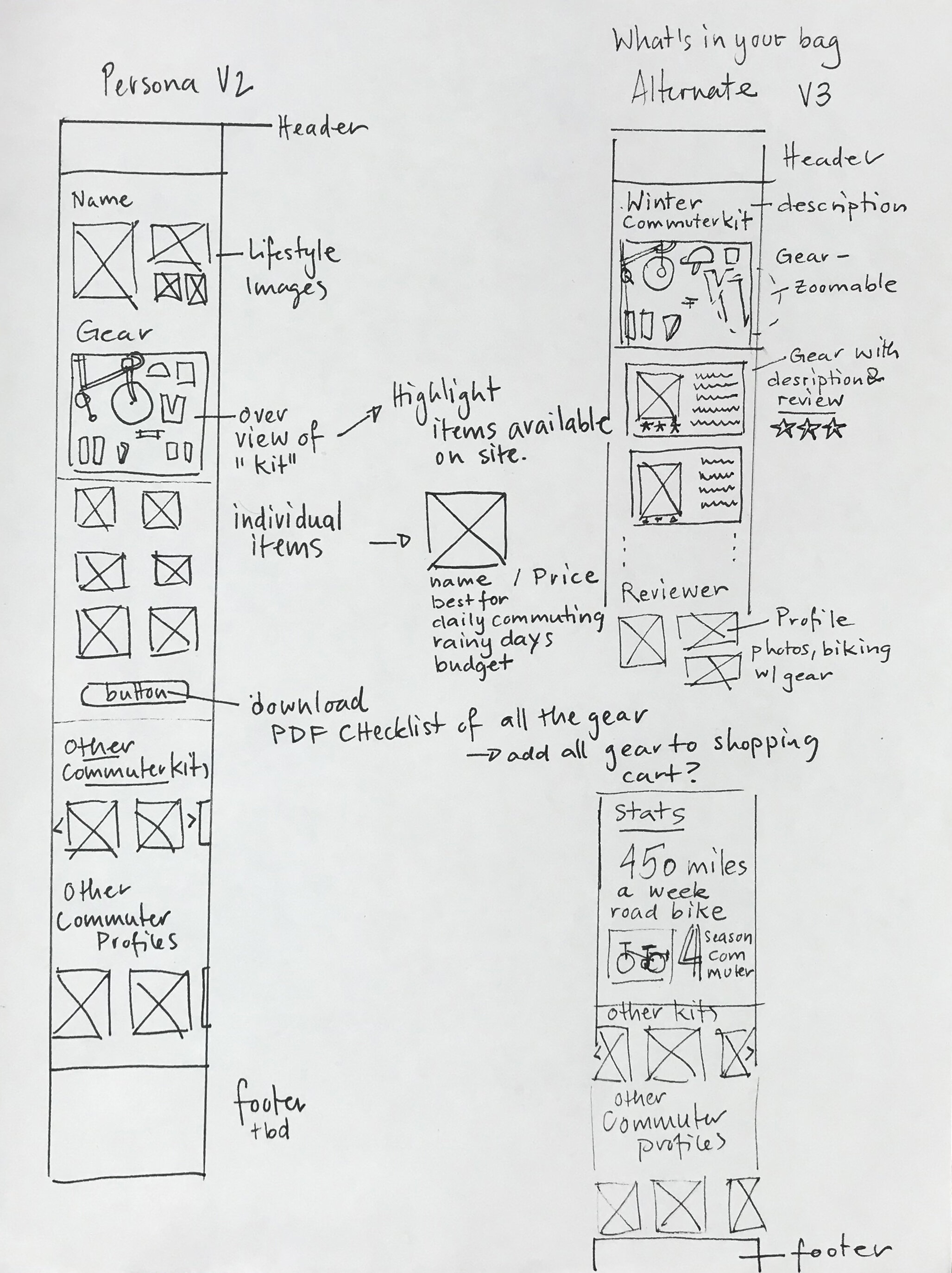
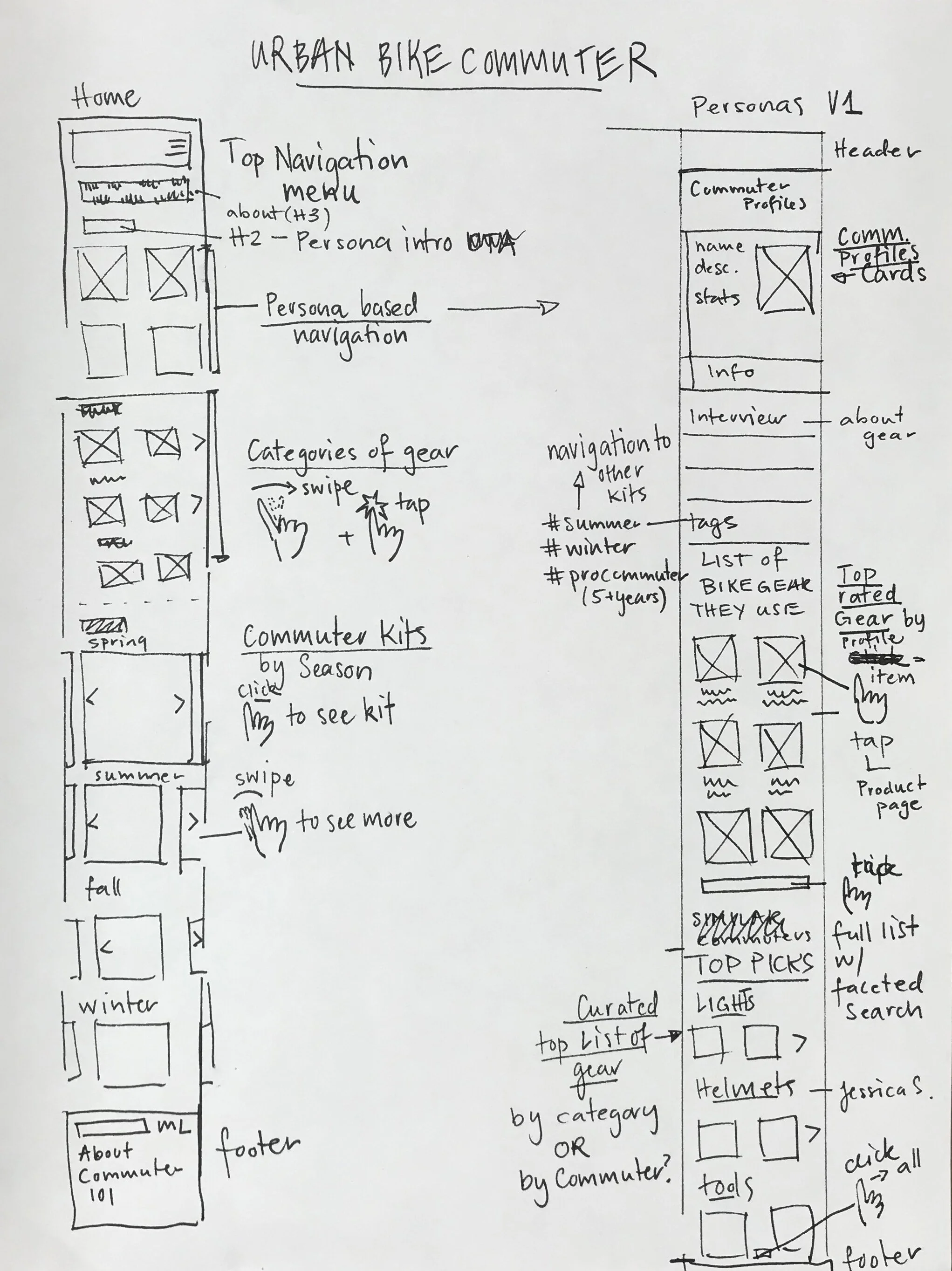
I worked on ways to present gear based on commuter style, length of commute, and season. "What's in your Bag?" and "Commuter Profiles" are essentially collections of gear based on these criteria.
I theorized that it would help users navigate more efficiently if I anticipated their needs and could direct people down their respective paths. Yet, still, give them the option to shop by item.
Creating Commuter Profiles: An evolution
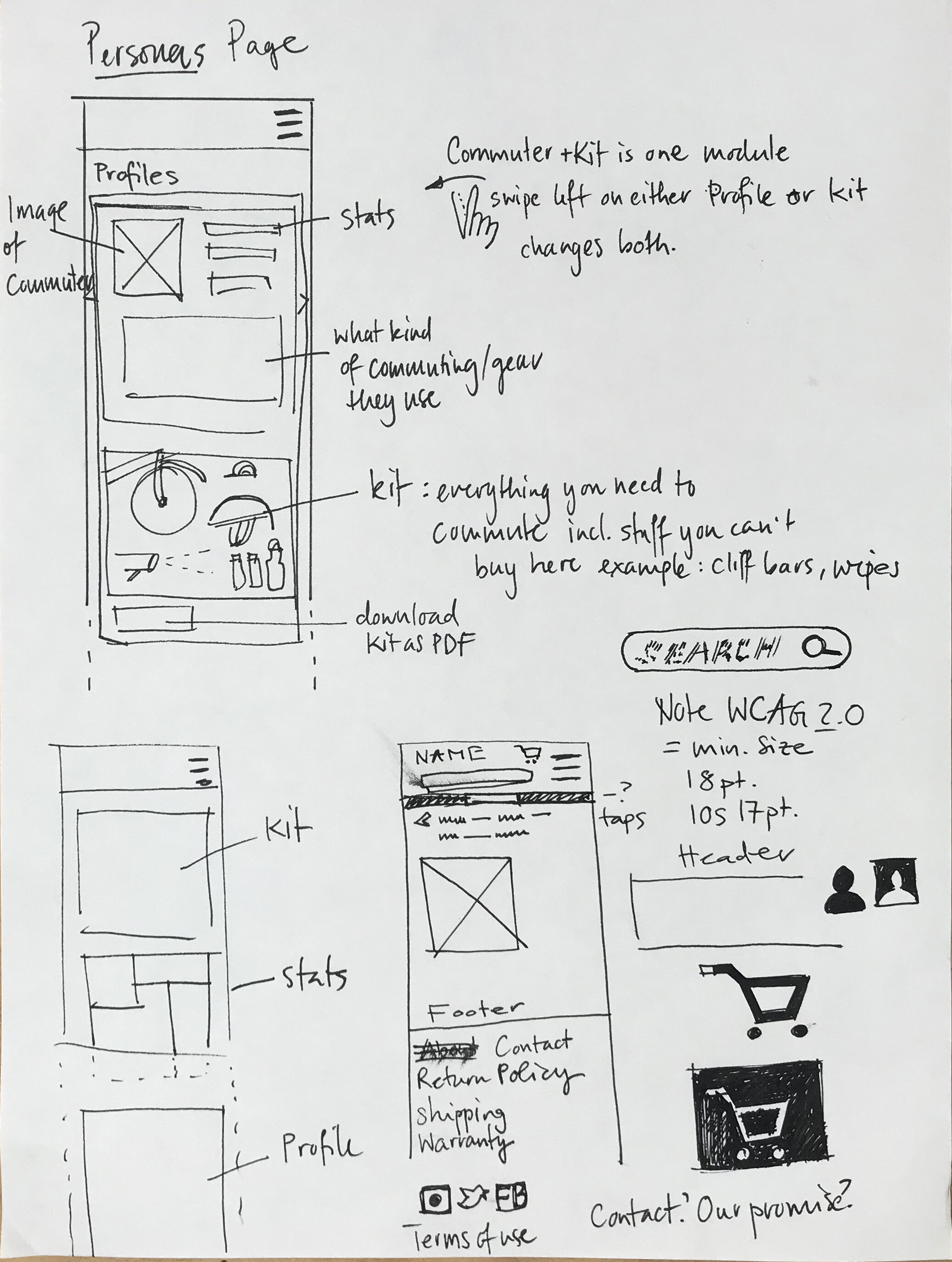
Based on the research and my hypothesis, I worked through different ideas of presenting, and grouping products. My initial idea was to have customers choose a commuter type that is similar to their own, and then explore what kind of gear they use.

“....Is it a lifestyle, social site? Where’s the gear?”
Testing, Iterating and Learning:
I tested each version with 2-3 people, asking them to find the gear they need to start commuting
Result: a 100% failure rate.
Issues:
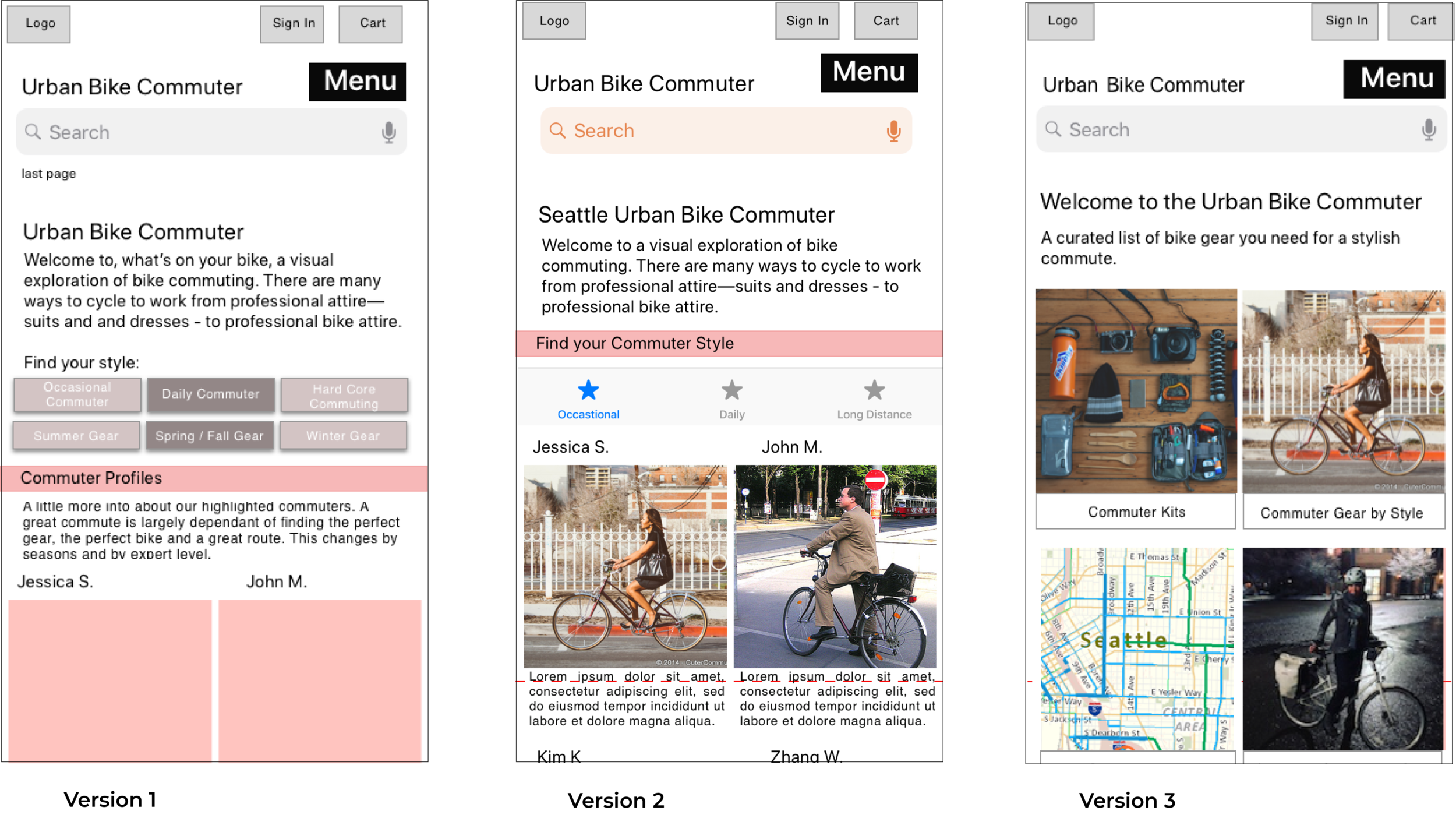
Home Page: I was so convinced that presenting gear based on a persona was such a great way to shop that I wasn't thinking thought the purchase flow and the labels and mental models. Testers could find the gear but didn't understand that the site was about selling gear, not just about learning how to use it or how to choose it.
Commuter Page: Users were confused with my commuter profiles and abandoned their search for gear once they hit the profile. Why? I figured the lack of success had to do with the fidelity of my prototype, so I created more high fidelity wireframes and tested again.
Further testing revealed it wasn't a fidelity but a layout issue. I presented my commuters in a style that looked like a Google Card, a design that users associate with being an end result, and that further navigation wasn't possible.
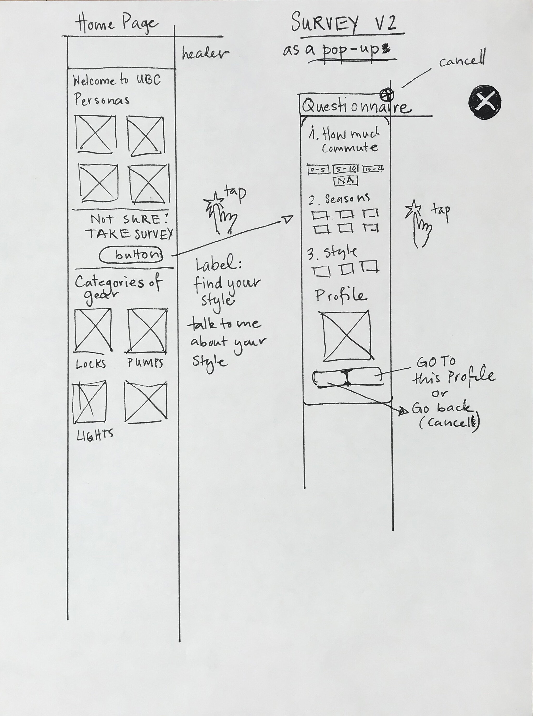
Testing and Iterating the Home Page:


Is it a failed Concept?
Once I realized that people had a hard time understanding how I was presenting the gear, I stopped the usability testing and interviewed people about the concept of the site.
I asked user to look through the prototype and tell me their impressions. Their responses were rather humbling. They had a hard time understanding what the site was about.
“What’s this site about?”

What’s the goal here?
The site is about gear. First and foremost you need to be able to buy gear.
By creating a new hierarchy and categories, I'm offering users different ways to explore and ultimately buy the gear.
The gear is now organized by "Shop by Style," "Shop by Season," and "What's in Your Bag?" (commuter kits). This lets shoppers explore, but the "Shop all Gear" is there to make sure there's a straight shot to “buy.”
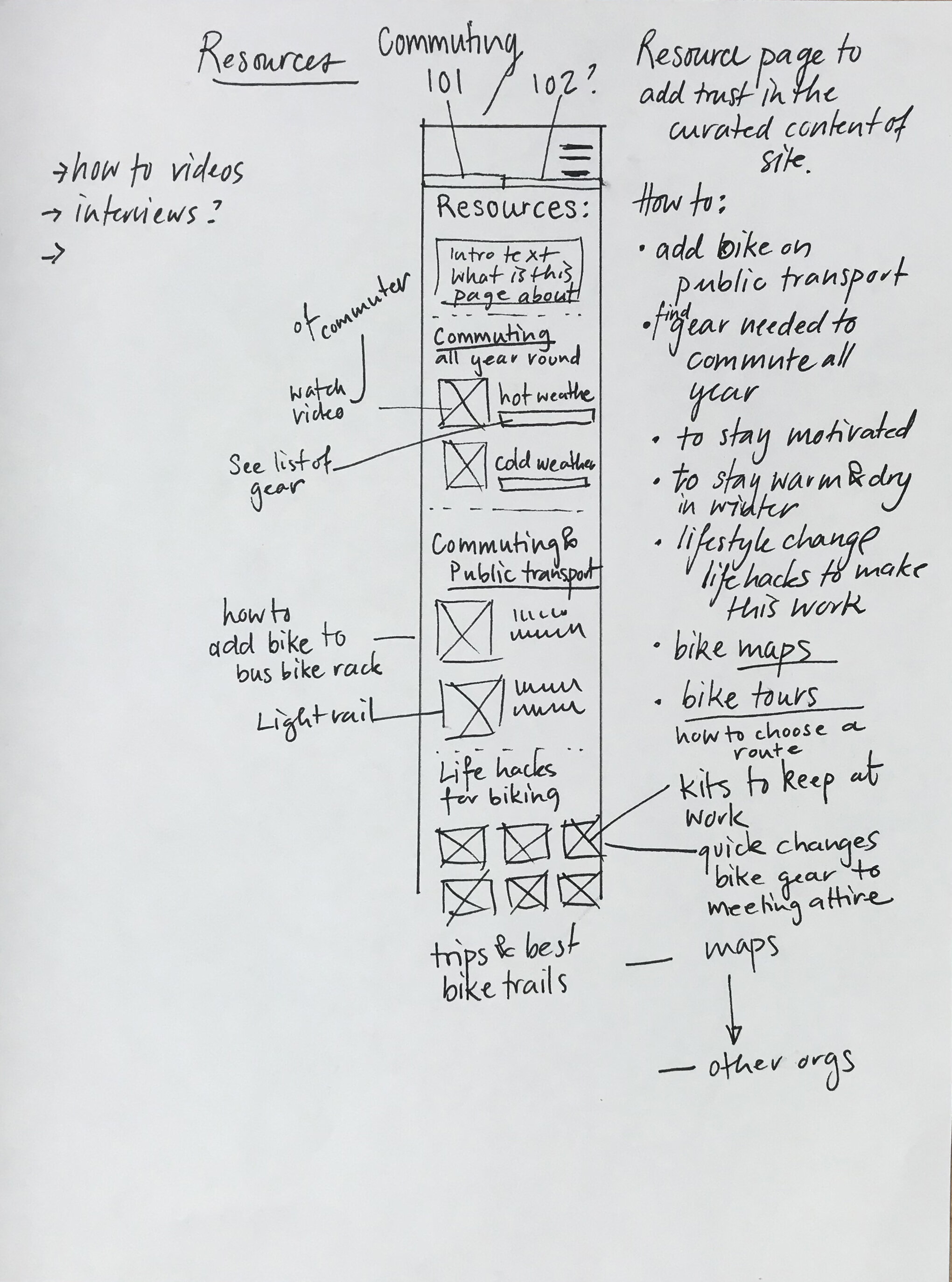
I also removed all but a couple of resources from the home page. They now live on the resource page, cutting down on the home page's indecisiveness and clutter.
I also reexamined the labels for the categories and changed the wording from a nebulous "Commuter Gear by Style" to a more straight forward "Shop by Style," "Shop All Gear."

Audience Based Navigation - is it about the person or about what they need?
What’s in your Bag?

The “persona” page also went through several iterations. Users didn’t really identify with the personas; they wanted to see the gear. Conceptually, the category is still the same, but instead of showcasing the person, the category is about the gear and commuting type.
Minimal and light

The gear is presented as kits, and users can download the full list to use as a checklist or to see individual items. Each item has a detailed review by the commuter and shows how it would attach to a bike.
I would like to test a “buy the full kit” for people who are just starting to bike. Of course, you would need to let users manually delete items they don’t need before checkout.
Each “persona” also gives some advice and showcases gear in action.
Some thoughts about Strategy
Trustworthy: It's vital for this concept to work, to have a resource page with detailed and useful information. The site's reviews and curated content are only credible if the visitor trusts the company.
Localize: I played with the idea of making the site super local. Each city would have different kits based on topography, city infrastructure, weather, and showcase a local celebrity who bikes.
Partnerships: There could be partnerships between Urban Bike Commuter Gear and local repair shops. Users could preview kits or pick them up at partner shops. Gear could be inspected and returned to a bike shop (offer installation). Owners of bike shops could be highlighted with their gear and give advice.
Social Media: Ask Seattle bikers "what's in your bag ?" and post on social. I'm always interested in what gear other bike commuters have. And my informal questioning of bike commuters shows that they are more than willing to share tips and gear preferences. It would be interesting to learn if they would publicly share what kind of gear they use.
“We may fall short of our goals but even in our failures, those things for which we strive somehow endure – precisely because we are striving for them. They have an intentional existence. We intend (that is, lean towards) a more perfect state, and the goal of that dream or striving locates itself mysteriously in the work. I’d like to suggest that some great works of art might themselves be failures and, moreover, that their failure contributes to their greatness. I also think it is possible that there is more genuine content in failure than in success.“
Joel Fisher